lunes, 23 de abril de 2012
Squared gothic
This one is gothic but it also has something that looks
German. The stroke is very thick and the curves are
squared. It seems to be build with flat panels.
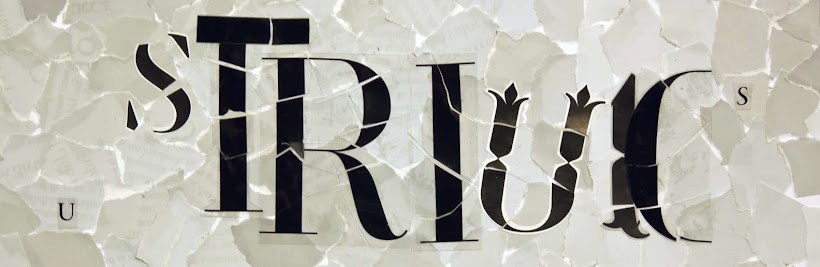
Outstanding letters
These letters seem to be written with a quill. They are
quite ornamental and complex.
Beständigkeit im Wechfel
Another example of gothic font. It looks quite old and
it reminds of the ancient books written by hand.
Gothic typography
Although this one is made with little squares it has the
characteristics that a normal gothic font would have.
It looks really similar.
domingo, 25 de marzo de 2012
Lego X high
This letter is made out of Lego pieces and it could be
a real Sans Serif typography.
Selling ice-cream
In some stores there is also used this type to call the
attention of the possible customers.
Pixel instructions
In the metro there are simple instructions written in
pixel letters. These typographies are very related to
machines and to technology.
Green pharmacy
Pharmacies also use this typographies a lot. They are
very useful when you are looking for something important
like a pharmacy because it stands out.
Credit 0,00
In the small screens of public telephones it is also a
pixel type. Here we can see the squared dots of each
letter.
Lottery booth
I found this type in a lottery booth. In all these pixel typographies
we can see the dots that create the letters.
Café into pharmacy
In some cafés we can find this kind of typographies because
with a short space you can write and say many things. Another
good point about these is that they catch our attention because
it is constantly moving.
Dad's car
This type reminds of the old fashioned models of cars
that had their name written with this kind of letters.
Retro hotel
This typography has a tall 'x' high and it has a lot of contrast
between the thicks and thins.
martes, 20 de marzo de 2012
American College
These letters have an old school american look like the
ones that universities used in their t-shirts and jackets.
Letterpress
This typography is like the antique types made with old
printing machines with metal or wooden types. These
typographies used to have some printing problems as we
can see here in the letter 'R'.
Saturday Night Fever
This type from a poster reminds of the disco times because
of the shape and the colors.
Typewriter
This type is from an old typewriter. Is monospaced because
all the letters have the same width.
lunes, 19 de marzo de 2012
Retro Chocolate
This type was used on an antique chocolate advertisement.
It has beautiful curves, is very rounded and it seems that
it has nature inspiration.
Doormats
Many shops have their name written on the entrance doormats.
The Massimo Dutti typography is classic and elegant, it looks
like it's been handwritten.
viernes, 9 de marzo de 2012
Golden letters
One of the old inscriptions we find in the streets of Madrid.
Heights
From the heights we see the typographies on Madrid's
roads that indicate the type of vehicles that can or cannot
circulate.
Pavement
We can also see typographies on old sewers.
Red and white
A Sans Serif type on a band on the floor.
jueves, 1 de marzo de 2012
UEM News
This university announcement is a transparent sticker on
the floor. We can see Sans Serif and Script typefaces.
lunes, 27 de febrero de 2012
Pantene new design
Pantene integrates a peculiar shape between its typography
that looks like hair in its new design. They have maintained the
same type but the other elements that surround the logo have
become more simple and accurate.
Tropical Africa
Cola Cao chose a bold, colorful and striking type for
their
brand. The colors are very contrasted and the whole
image is quite funny and have a young appearance.
Doves fly
I especially like Dove typography because it reminds of
a flying bird. It seems that the type is floating and it has
beautiful lines. It's very elegant.
Nestlé cares about lower case letters
Nestlé typography uses that upper line to 'protect' the
lower case letters as well as an accent for the e. This
is related with the kind of products they made, especially
the ones directed to small children.
martes, 21 de febrero de 2012
Chocolate
A classic typography in Nestlé chocolates.
sábado, 18 de febrero de 2012
LOEWE
This typography is printed on a beautifuly textured bag.
Exclusive Coca-Cola bottle
One of the most famous logotypes, Coca-Cola, on a special
edition of the bottle especially designed for ARCO.
jueves, 16 de febrero de 2012
From the inside
We can find Sans Serif typographies on the tiny pieces of our
computers. It seems these types work better in small sizes than
the Serif ones.
miércoles, 15 de febrero de 2012
Keyboard letters
On the keyboard of our Mac computers we also find a Sans
Serif typography.
martes, 14 de febrero de 2012
Back in time
Even in old stone inscriptions the typography is Sans Serif.
Book covers
One of the most sold books this season has on its cover another
Sans Serif typography. Maybe it's because these typographies are
more modern and they are more in touch with new technologies.
lunes, 13 de febrero de 2012
Metro
Metro of Madrid also uses a Sans Serif typography and it's the
best
option for something that important.
viernes, 10 de febrero de 2012
636 CloseUp Polaroid
Polaroid. Another brand that chose a Sans Serif type for its
products.
jueves, 9 de febrero de 2012
Milton Glaser using Sans Serif
The first example of sans serif typographies in my environment.
Milton Glaser was right, Apple computers are to design as microwaves
are to cooking.
Entradas más recientes
Inicio
Suscribirse a:
Entradas (Atom)